Chang Ning-Chun has started her design career in the UK since 2017.
Graduated from University of the West of England, Bristol (U.W.E).
Photography partner in 1zerozerozero studio.


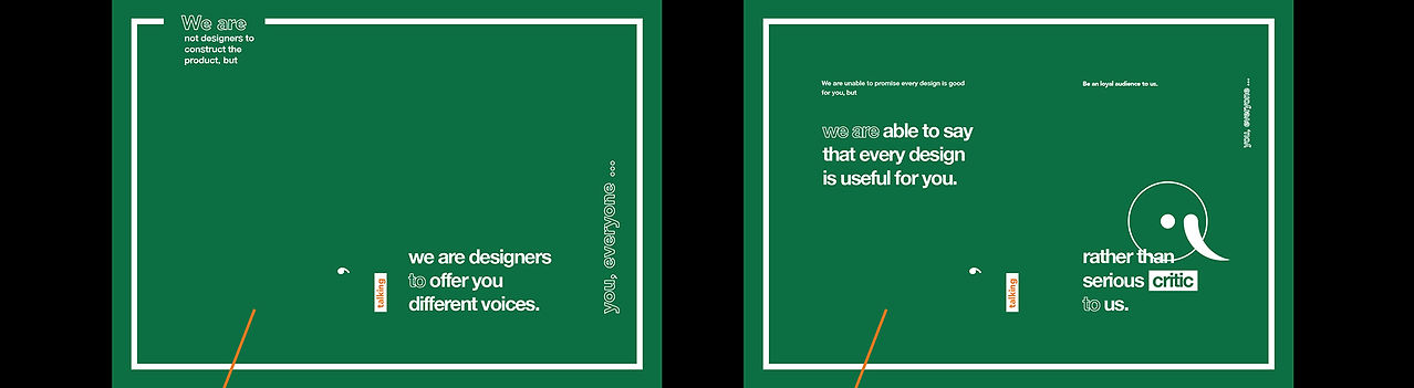


“We are a manifesto” is developed personally for individual statement with three target audiences, including employers, graphic designers and customers. Every chapter is arranged intentionally, beginning with the ‘we are’ collective for exhorting readers to follow, to listen or to believe it.
In this project, some design ways were fulfilled. The typography features a combination between the western typography rationale, geometry, and that of the East, stroke. The word’s layout could be realized by literal and pictorial meanings, inspired by Paul Rand’s IBM poster in 1981.
WE ARE
A MANIFESTO
Category: Editorial, Type Design
School Project
Year: 2015